Lingkaran:
Creative Education Platform
Branding | Service & Startup
Lingkaran is the leading creative education platform in Indonesia that provides entrepreneurial development programs and various skill classes, ranging from public speaking to flower arrangements. Founded in late 2014, Lingkaran has more than 500 programs, inspires more than 80,000 people, and created limitless collaborations.
After four years of tinkering, and many ups and downs, Lingkaran is finally ready to show its improved company values and a new direction. And of course, a re-branding is in order—a challenge that we were very excited to tackle.
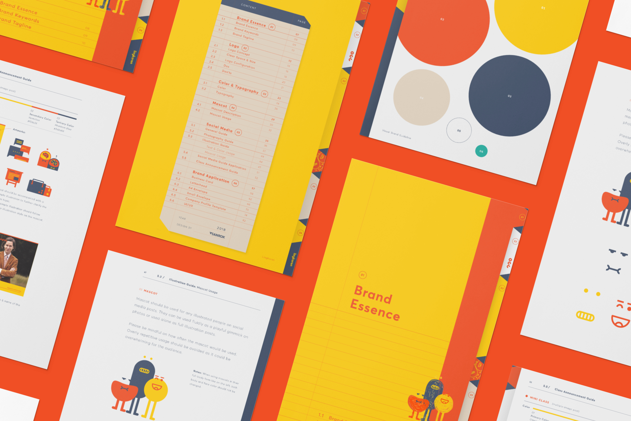
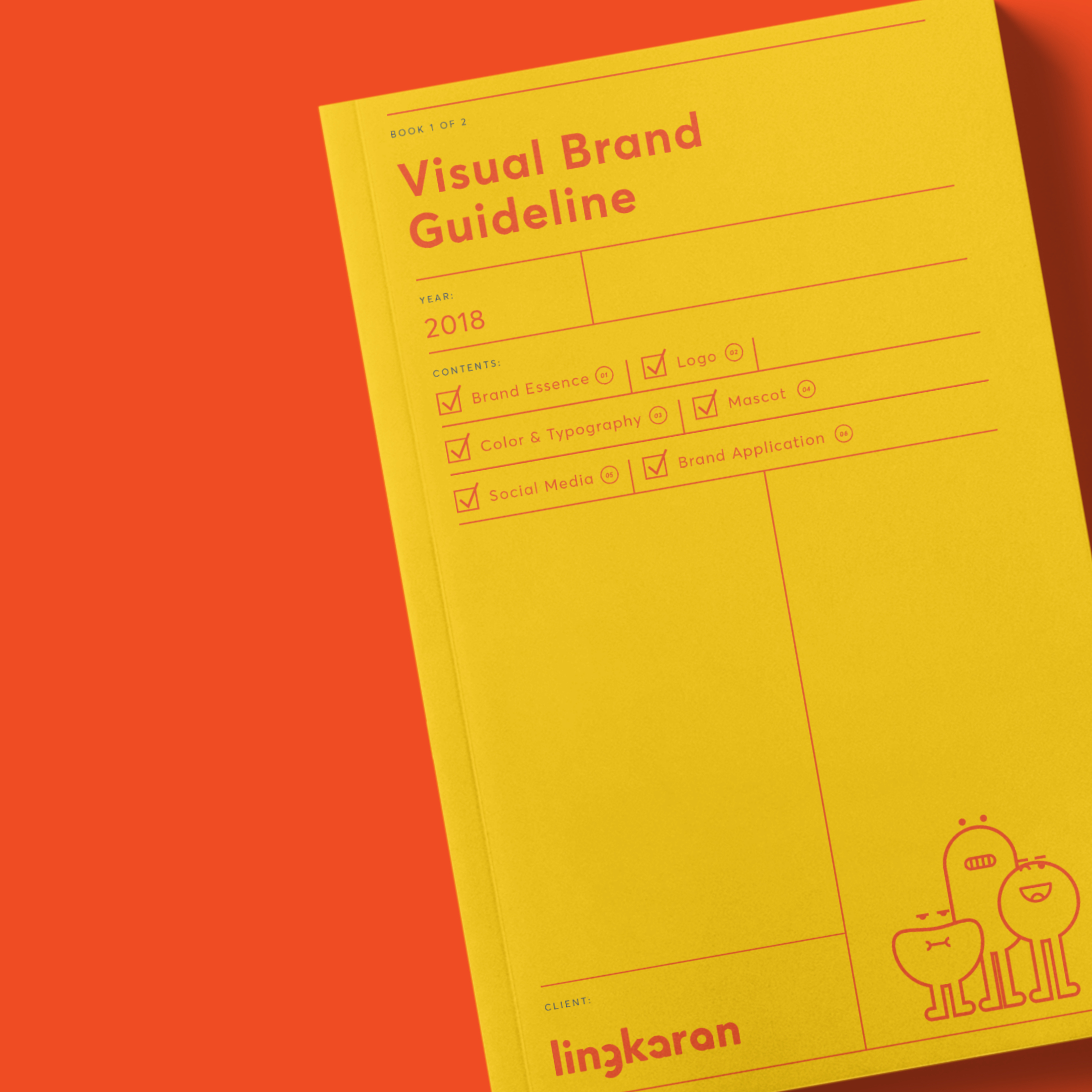
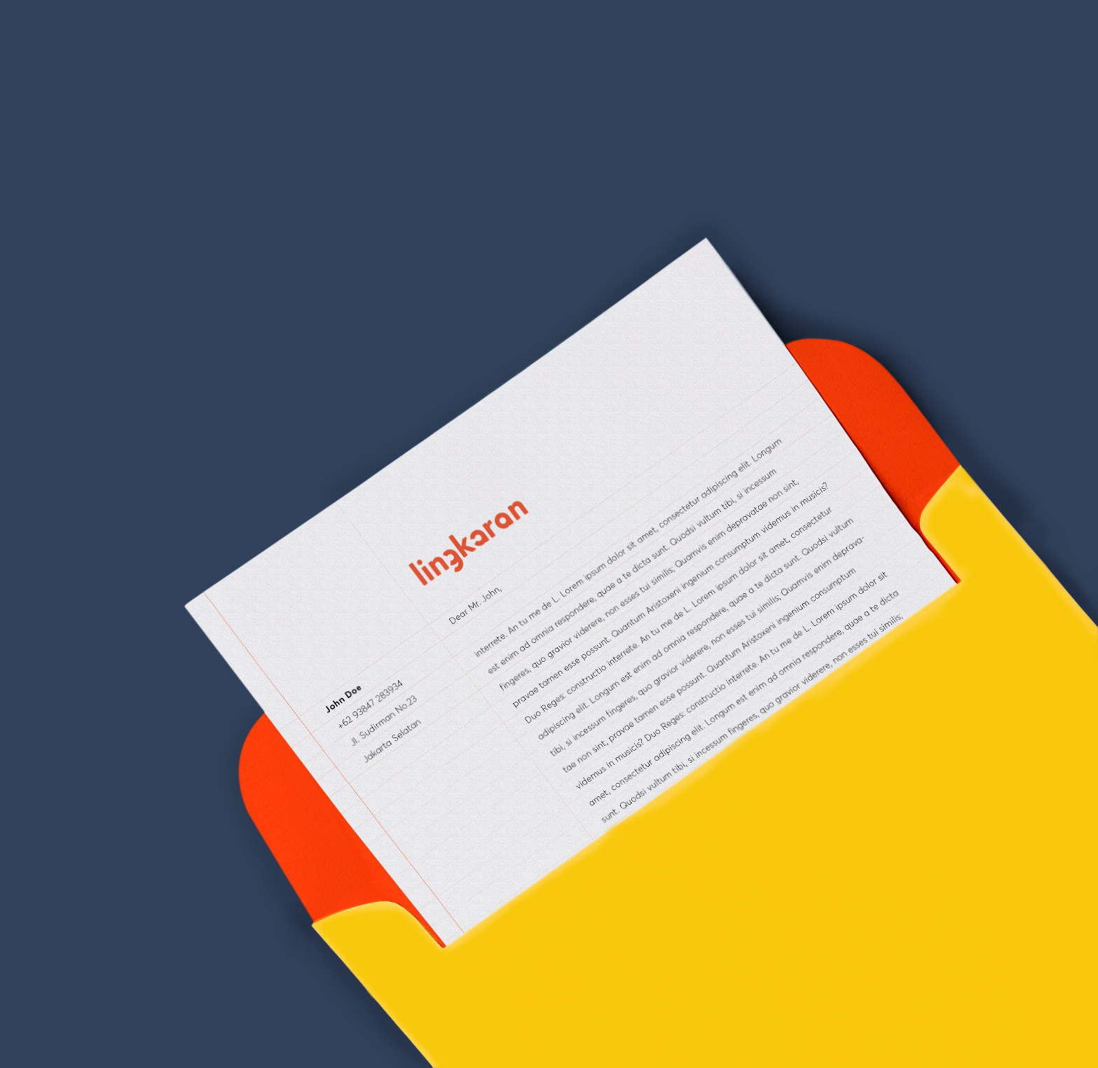
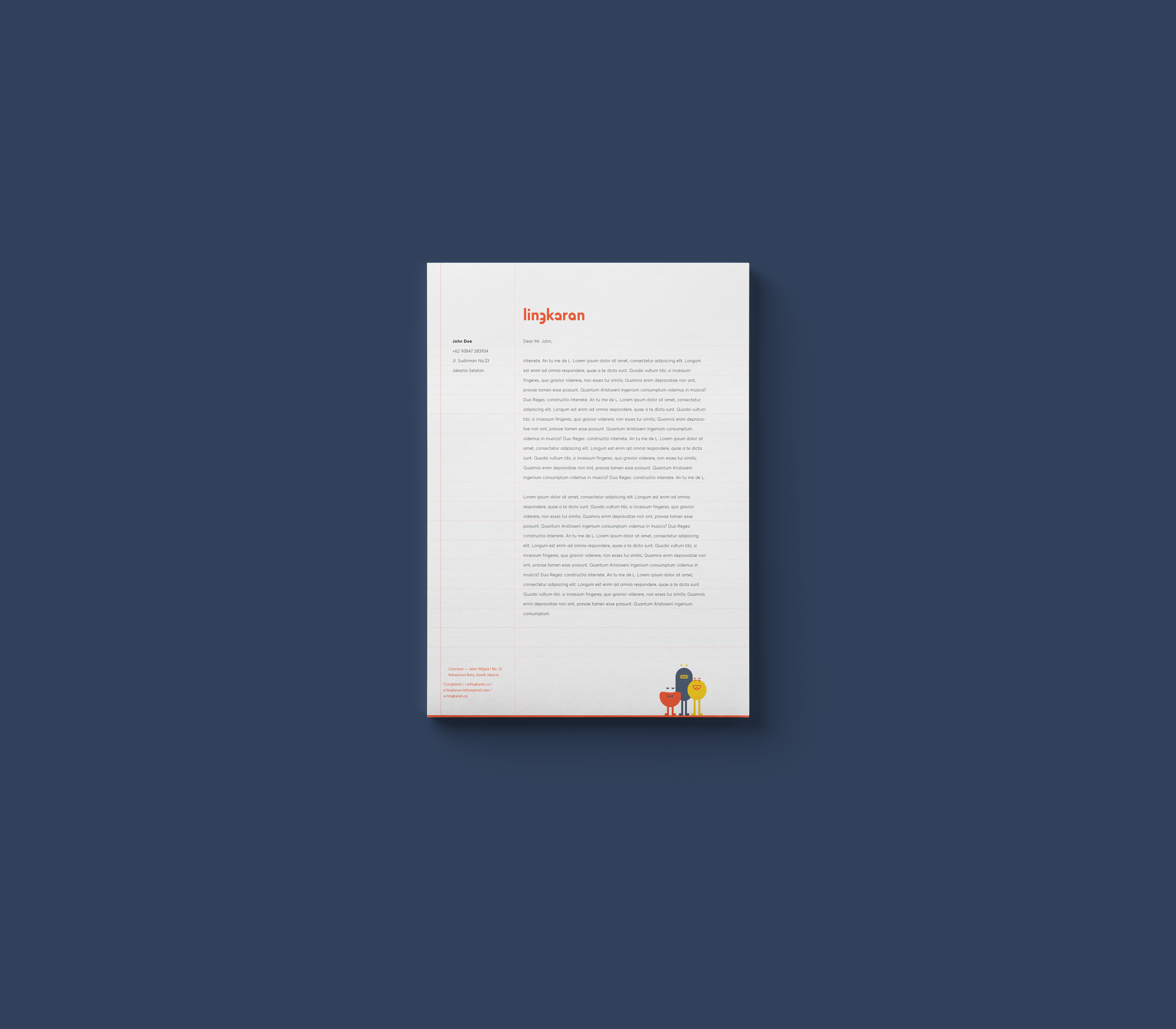
SANROK created the whole visual branding, brand concept & new logo, brand mascot, campaign ideas, social media guideline, website visual asset, and stationeries.
After four years of tinkering, and many ups and downs, Lingkaran is finally ready to show its improved company values and a new direction. And of course, a re-branding is in order—a challenge that we were very excited to tackle.
SANROK created the whole visual branding, brand concept & new logo, brand mascot, campaign ideas, social media guideline, website visual asset, and stationeries.
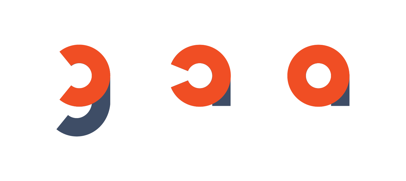
Lingkaran, in its very essence, is about learning process. It’s a progressive ecosystem for all type of learners to gradually evolved from (1) unrealized potential to (2) a passionate learner, and finally become (3) a person that is able to share knowledge to their peers. This process is what we called as Circle of Potential—because “Lingkaran” is a “circle” haha, get it?
Ehem.
Bad pun aside, we thought that this analogy fits Lingkaran perfectly, as it exists to “complete” the circle that exist inside all learners.
And it turns out that the name Lingkaran has 3 circle in it—what a coincidence, as if we planned it all! (yes we did).
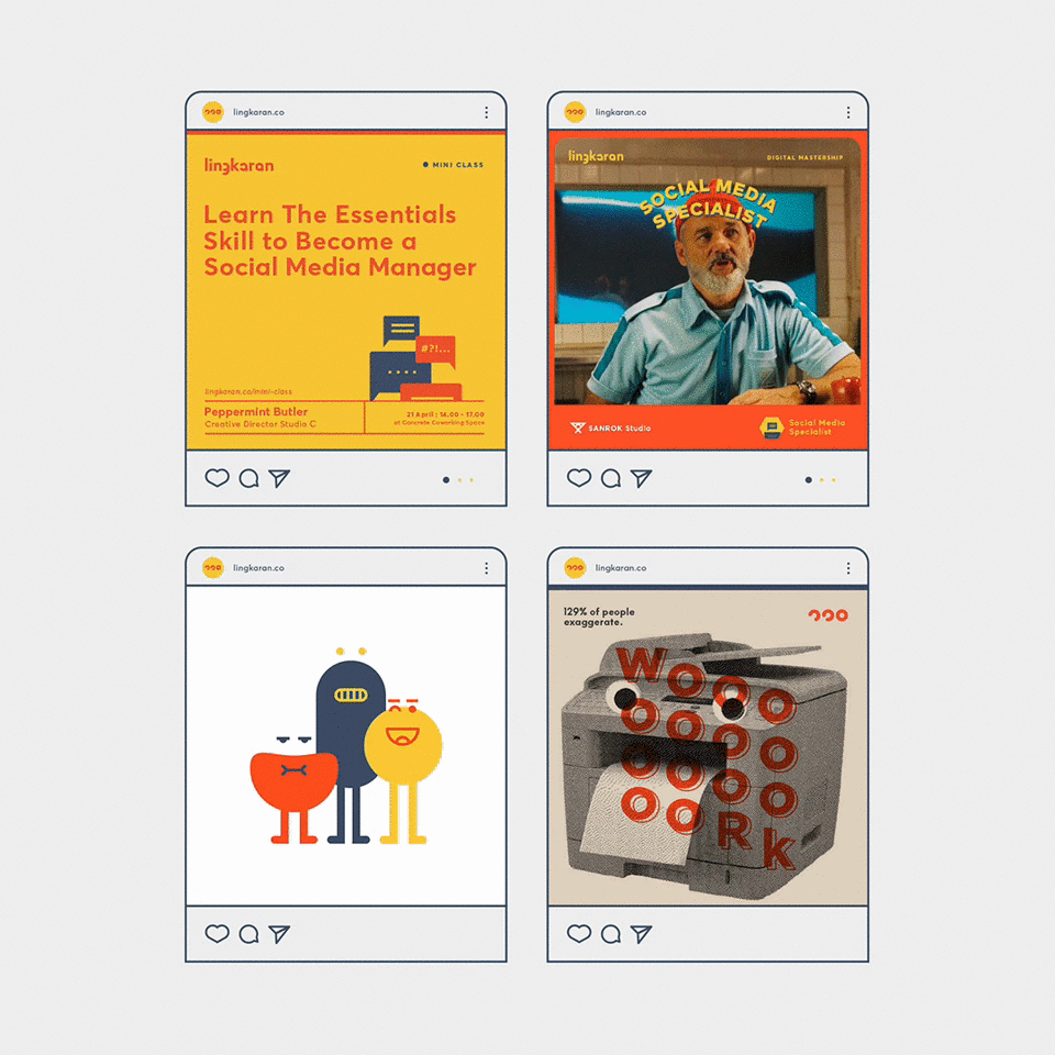
The re-branded Lingkaran is quirky, vibrant, and unapologeticly expressive, so we decided to bring them to life with brand mascots. There 3 of them, each representing a particular learning stage. From left to right: “Linka, The Potential”, unsure and lacking confidence but has fiery motivation to change, it’s the early learning stage where there are plenty of potentials to be maximized; “Kara, The Sponge”, absorbing every knowlegde and opportunity in Lingkaran like a sponge; “Aran, The Lingkaran”, found the perfect shape of itself with maximum potential, it’s ready to share knowledge in Lingkaran community.


We implemented the diversity campaign throughout videos, posters and posts on social media.
As you can see, the brand applications are fun as we explained before.
As you can see, the brand applications are fun as we explained before.

Art Director
Michael Alexander
Tito Yusuf
Senior Designer
Candya Pradipta
Editor
Tiffany Alexandra
Michael Alexander
Tito Yusuf
Senior Designer
Candya Pradipta
Editor
Tiffany Alexandra
Team Notes
“The process was fun just like back at school. Yeah, we also mean those tears and blood (okay, we’re a bit melodramatic here). But that’s what makes interesting, isn’t it?”
“The process was fun just like back at school. Yeah, we also mean those tears and blood (okay, we’re a bit melodramatic here). But that’s what makes interesting, isn’t it?”
All images & contents © 2012-2022 SANROK Studio. All rights reserved. No part of this publication may be reproduced, distributed, or transmitted in any form or by any means, including photocopying, recording, or other electronic or mechanical methods, without the prior written permission of the publisher, except in the case of brief quotations embodied in critical reviews and certain other noncommercial uses permitted by copyright law.