Papiri:
Coffee, Cuisine, Collaboration
Branding | Food & Beverage
When one of our good friends came to us with a passion in his eyes and a fun project, we couldn’t help but feel excited.
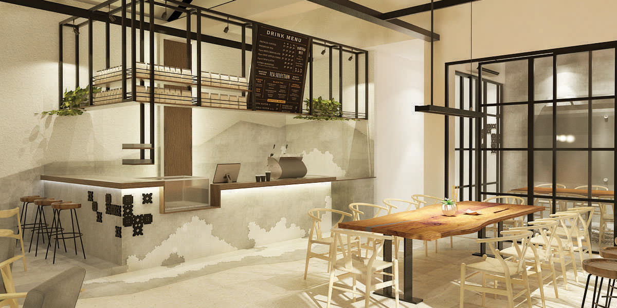
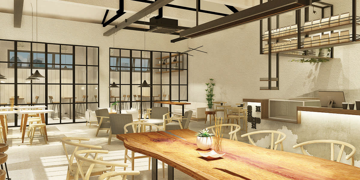
Calling Papiri as a coffee shop might be an understatement. It is, at its core, a collaboration working space, a perfect place for short lunch-break session, chat & discussion, and creative works—a concept that created a huge wave on the early 2015. Located in the heart of creatives in Kemang, South Jakarta, Papiri is the spot for young creatives to fulfill their basic career and tummy business.
SANROK created the whole visual branding, sign system, interior elements, stationeries, proposal, packaging, and content writing.
Back in the old days, library wasn’t only used for storing archives and books. Take the example from the Villa of Papyri, and ancient library in Italy. Villa of Papyri was used by the people to challenge ideas, gain new information from the books and have debate and discussions. Library was the milestone of civilization back then.
What SANROK did was capturing the essence of ancient library usages, and imbuing it with modernity and a trace of Indonesian local values—creating a brand with sophisticated cultural-reference.
What SANROK did was capturing the essence of ancient library usages, and imbuing it with modernity and a trace of Indonesian local values—creating a brand with sophisticated cultural-reference.

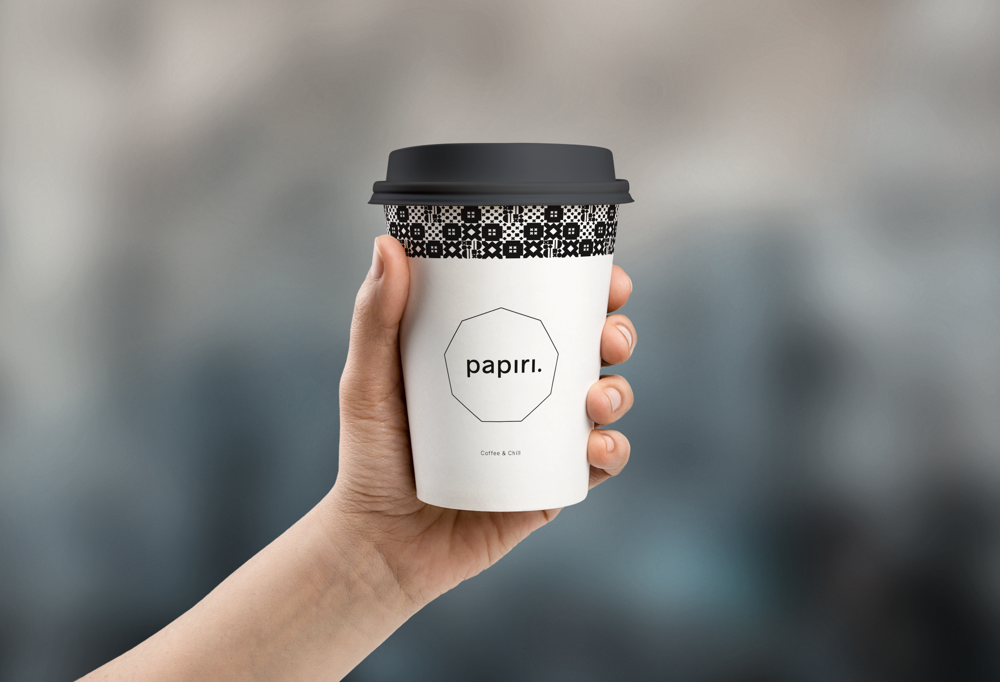
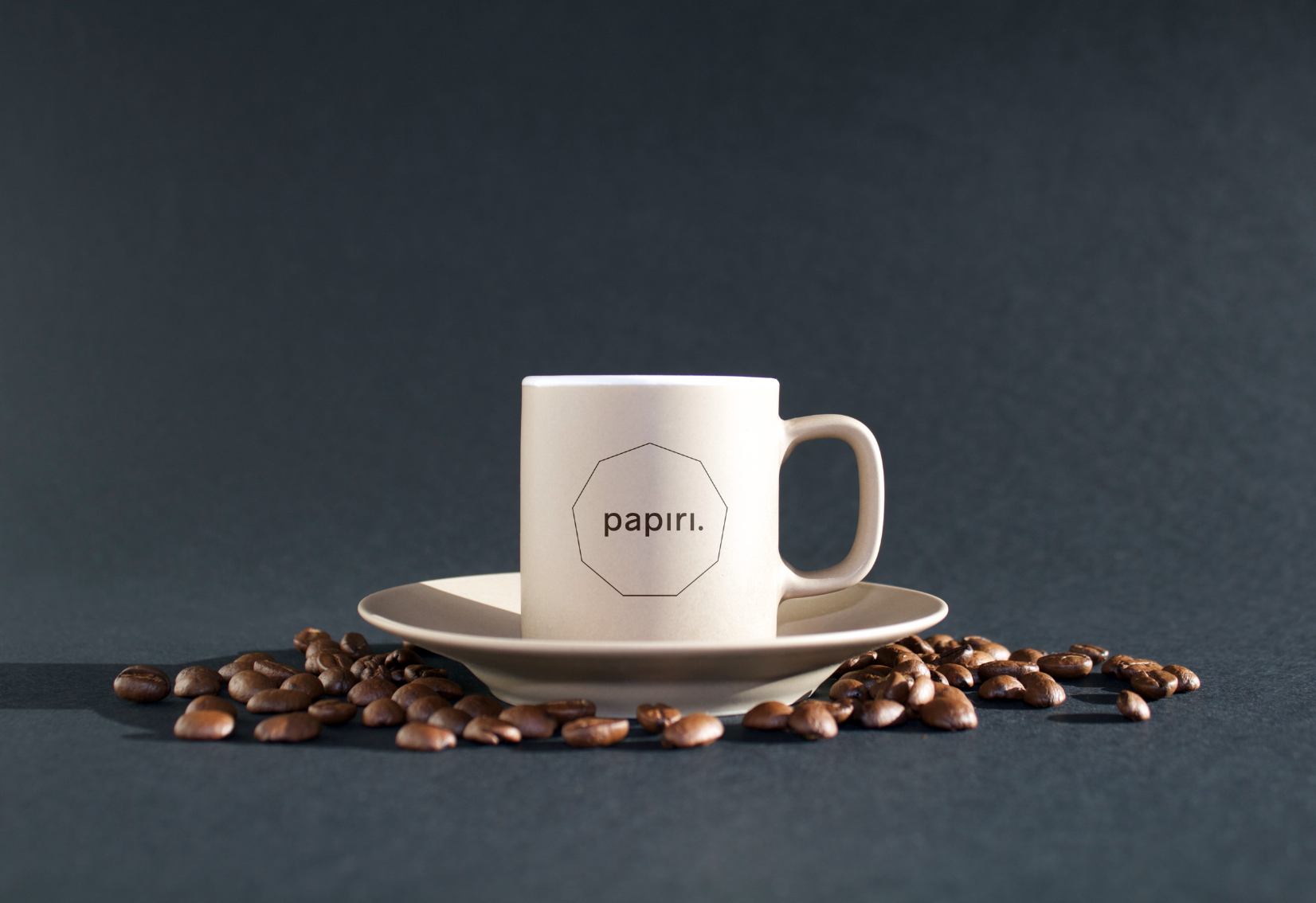
The name Papiri comes from Villa of Papyri, an ancient library in Italy, where a unique collection of papyrus scrolls was found. With a little twist, SANROK took the name “Papyri” and made it into Papiri—a tiny change to make it more familiar to Indonesian people. We don’t want someone to say it like “Pay-pie-ree”, right.
When pronounced, Papiri invokes a friendly tone and an openness. It rolls off the tounge, too. Try saying it multiple times.
When pronounced, Papiri invokes a friendly tone and an openness. It rolls off the tounge, too. Try saying it multiple times.
SANROK took the liberation to put a nonagon (9) as the border of the logo to represent three things; first, 9AM is the best time to drink coffee for productivity; second, the angle to make each turns on the nonagon is exactly 140º–coincidentally similar to the best temperature to roast coffee in fahrenheit; third, The National Coffee Month in Indonesia falls at September, 9th.
The fourth reason might be ‘cause we just loved the shape, and we tried to find reasons to justify it.
The fourth reason might be ‘cause we just loved the shape, and we tried to find reasons to justify it.

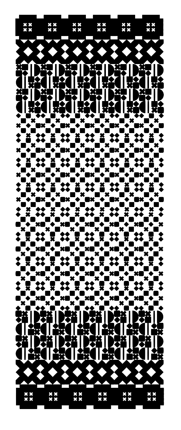
To inject the local value, SANROK also made a contemporary representation of Indonesian classic patterns with basic geometry shapes. The patterns are made to be flexible enough to be applied on every item on the coffee shop—interior, packaging, stationaries, social medias, etc.


PAPIRI also got featured on several medias and music videos in Indonesia. Here are few of them.
Art Director
Michael Alexander
Senior Designer
Triandi P. Ramadhan
Editor
Tiffany Alexandra
Copywriting
Tiffany Alexandra
Wordshelf Studio
Interior Design Partner
Suasana Studio
Michael Alexander
Senior Designer
Triandi P. Ramadhan
Editor
Tiffany Alexandra
Copywriting
Tiffany Alexandra
Wordshelf Studio
Interior Design Partner
Suasana Studio
Team Notes
“Overall, Papiri is a nice small project where we could express our design skills without too many restrictions and border. Like many of our short projects, we tried to fit as many items as we could, given the budget.
We’re especially proud of the patterns and their implementations on the interior. Kudos to Suasana Studio as our Interior Design Partner—such a pleasant team to work with. They translated and adapt the visual designs nicely into interior elements.”
All images & contents © 2012-2022 SANROK Studio. All rights reserved. No part of this publication may be reproduced, distributed, or transmitted in any form or by any means, including photocopying, recording, or other electronic or mechanical methods, without the prior written permission of the publisher, except in the case of brief quotations embodied in critical reviews and certain other noncommercial uses permitted by copyright law.