Interfax, Harmonic Percolator HP-1
(Distortion Fuzz Pedal)
Experiments
What is this?
Some of you who play guitar might know about shin-ei super fuzz or tone bender legendary status of fuzz pedal, this one might be not as popular or well known as them due to its minuscule amount of it being produced. Harmonic Percolator HP-1 is a distortion fuzz guitar pedal made in early 70’s by small electronics repair business in Milwaukee, Wisconsin belong to Ed Geise called InterFax Electronics. They’re mostly do reparation for keyboard and amplifiers, but also they created a small batch of instrument effect pedals, including Harmonic Percolator HP-1.
But sure this one have a big reputation and cult of personality among musicians, discussed in many gear forum and demos for its weird, very distinct and uniquely signature broken radio sound you can made out of it (most notably linked to recording engineer and musician Steve Albini-shellac, Big Black), yet we’re here not gonna talk about that, we’re here because of its sweet and eccentric design.
Most of us didn’t realise that guitar pedal is one of many tangible things that can be used as a media for graphic design, since so many different functions and characteristics sounding of them can be used as a reference for design exploration. People put illustrations, graphics, typography, experimenting on the material and knobs—it’s not only about the sound, the visual matters too! (at least for us), this so-called ugly beige box has an uncommon design we’re intrigued to talk about.
![]()
(Image courtesy of Reverb.com)
Some of you who play guitar might know about shin-ei super fuzz or tone bender legendary status of fuzz pedal, this one might be not as popular or well known as them due to its minuscule amount of it being produced. Harmonic Percolator HP-1 is a distortion fuzz guitar pedal made in early 70’s by small electronics repair business in Milwaukee, Wisconsin belong to Ed Geise called InterFax Electronics. They’re mostly do reparation for keyboard and amplifiers, but also they created a small batch of instrument effect pedals, including Harmonic Percolator HP-1.
But sure this one have a big reputation and cult of personality among musicians, discussed in many gear forum and demos for its weird, very distinct and uniquely signature broken radio sound you can made out of it (most notably linked to recording engineer and musician Steve Albini-shellac, Big Black), yet we’re here not gonna talk about that, we’re here because of its sweet and eccentric design.
Most of us didn’t realise that guitar pedal is one of many tangible things that can be used as a media for graphic design, since so many different functions and characteristics sounding of them can be used as a reference for design exploration. People put illustrations, graphics, typography, experimenting on the material and knobs—it’s not only about the sound, the visual matters too! (at least for us), this so-called ugly beige box has an uncommon design we’re intrigued to talk about.
(Image courtesy of Reverb.com)
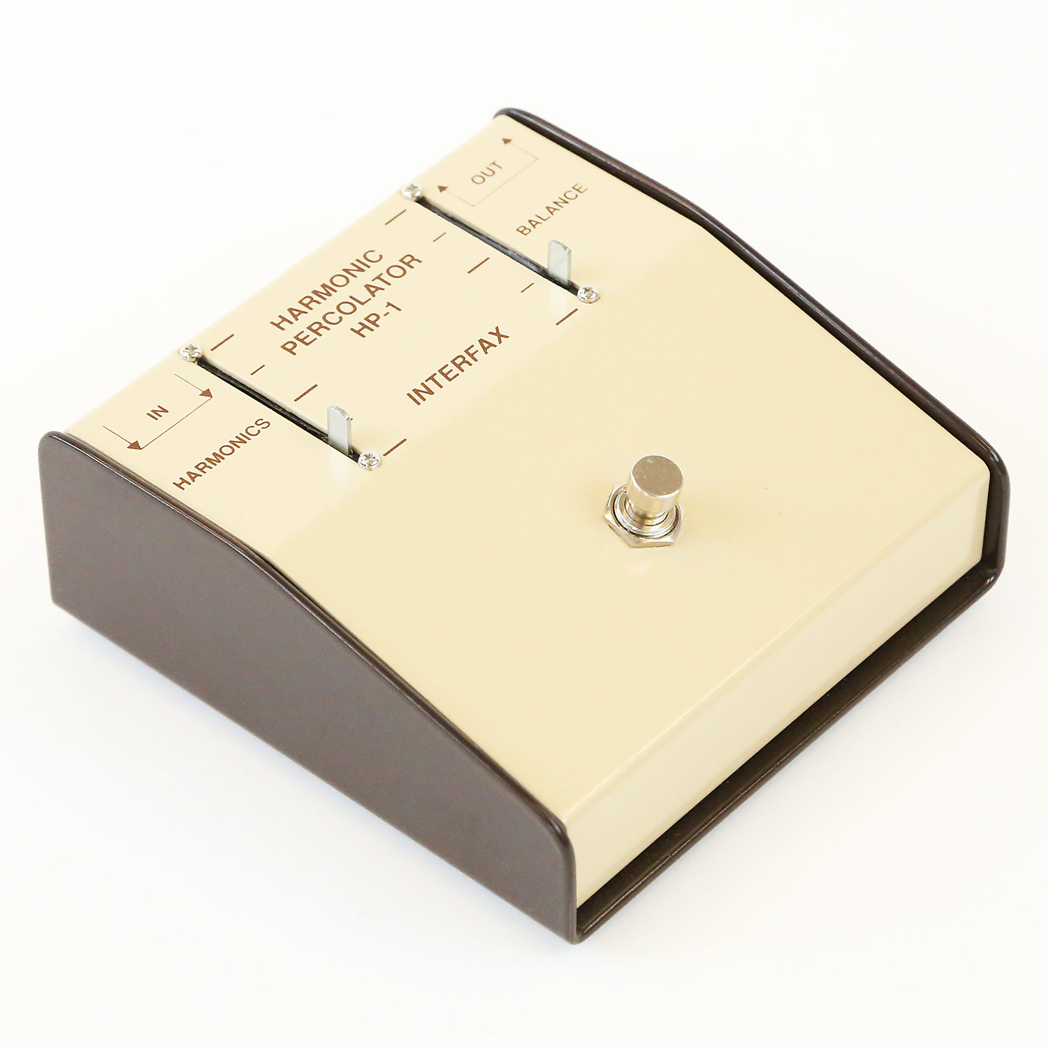
InterFax Harmonic Percolator HP-1
Made in early 70’s in Milwaukee, Wisconsin USA
(Image courtesy of Reverb.com)
Our Toughts
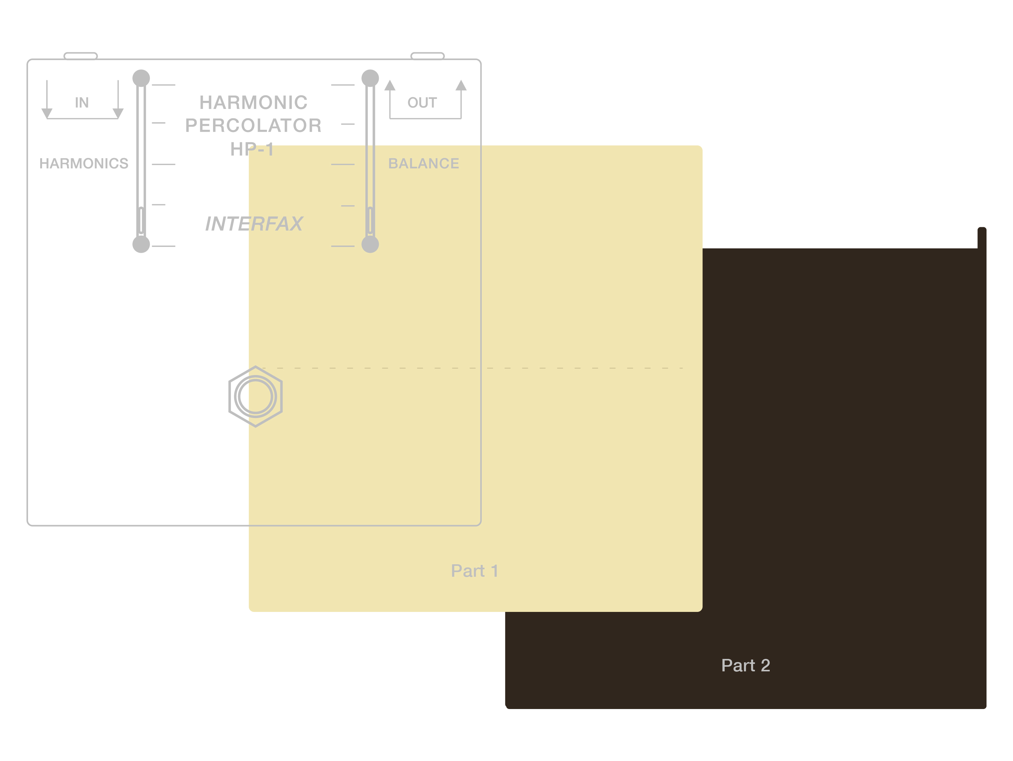
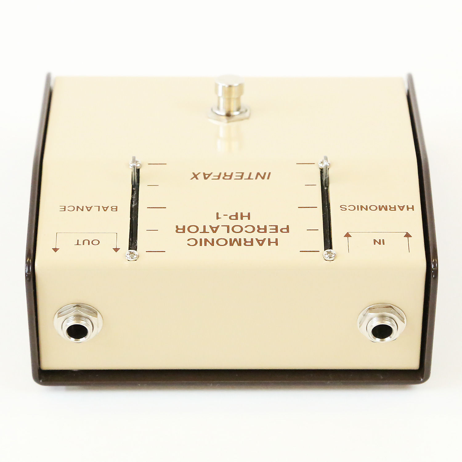
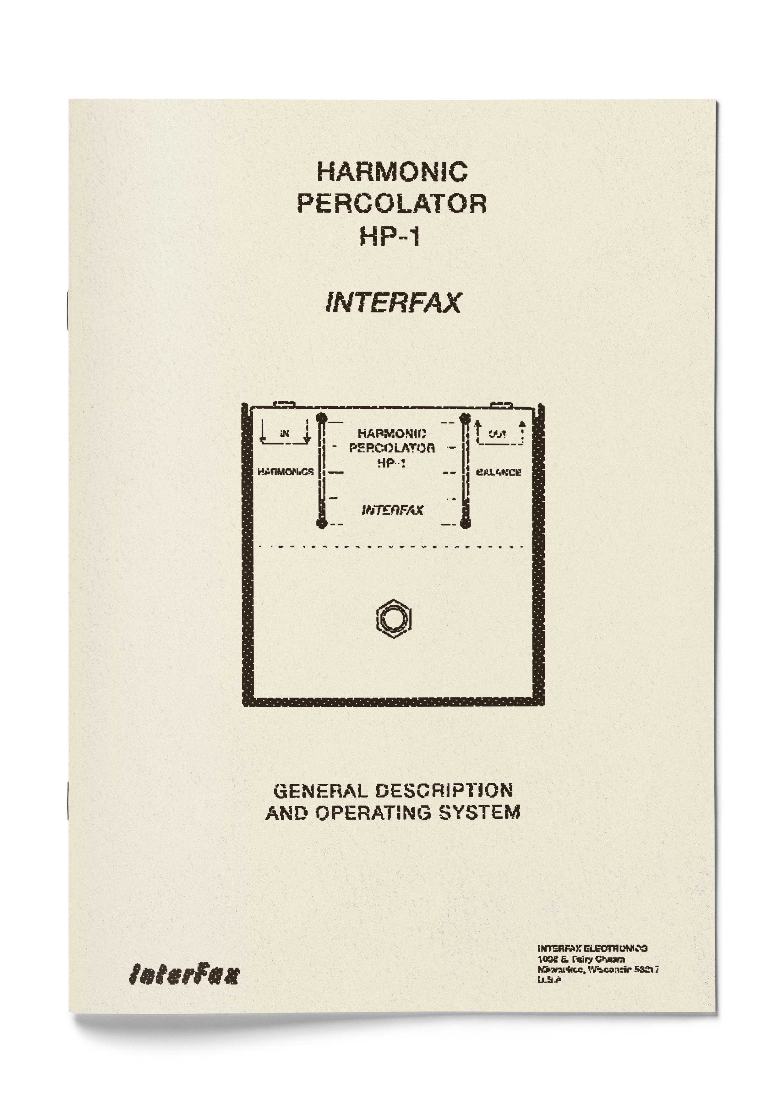
Unlike these days, back in 70’s guitar effects pedal has a big bulky enclosure, some of them has weird configuration and oddly shaped box. No exception for HP-1 too, this pedal have not too big but also not that small box, slanted to the bottom side. Fully made by metal, the enclosure made from 2 different pieces. One is the main part where the switch, the slider and I/O jack installed, and one more as a cosmetically frame-like part encase the left, right and under side of the enclosure.
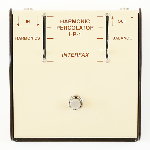
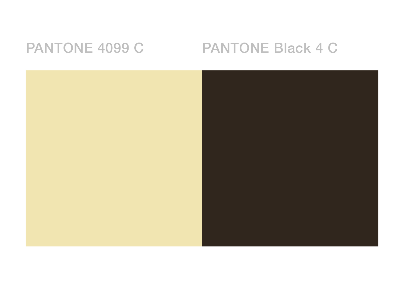
These 2 parts has nice and contrast colour, part 1 (as seen to the picture) is painted by light beige colour, and part 2 with its brown, dark undertone. These 2 colours combine give a pleasant appealing look of sweet and cold panna cotta with chocolate sauce (yum!). Not a common colour for distortion pedal obviously, especially due to the fact that this pedal is more than capable to make your guitar sounds like a crummy, gnarly-fuzzed tone. But still, this is a perfectly nice & contrasty combination of colours to put on a guitar pedal, we also put pantone color match the actual colour of the enclosure.
HP-1 has a humble looking simple interface, with one footswitch in the slanted middle bottom area to turn it on or off, and 2 controls, harmonic and balance. Each one is controlled with uncommon weird metal slider, there is no knobs on it, unlike any other slider we’ve ever seen, this slider has no tip on it, just a small metal bar with rounded edge, which add more bizarre nuance on it (looks cute actually). In addition its reversed I/O jack makes it more unusual than it is.
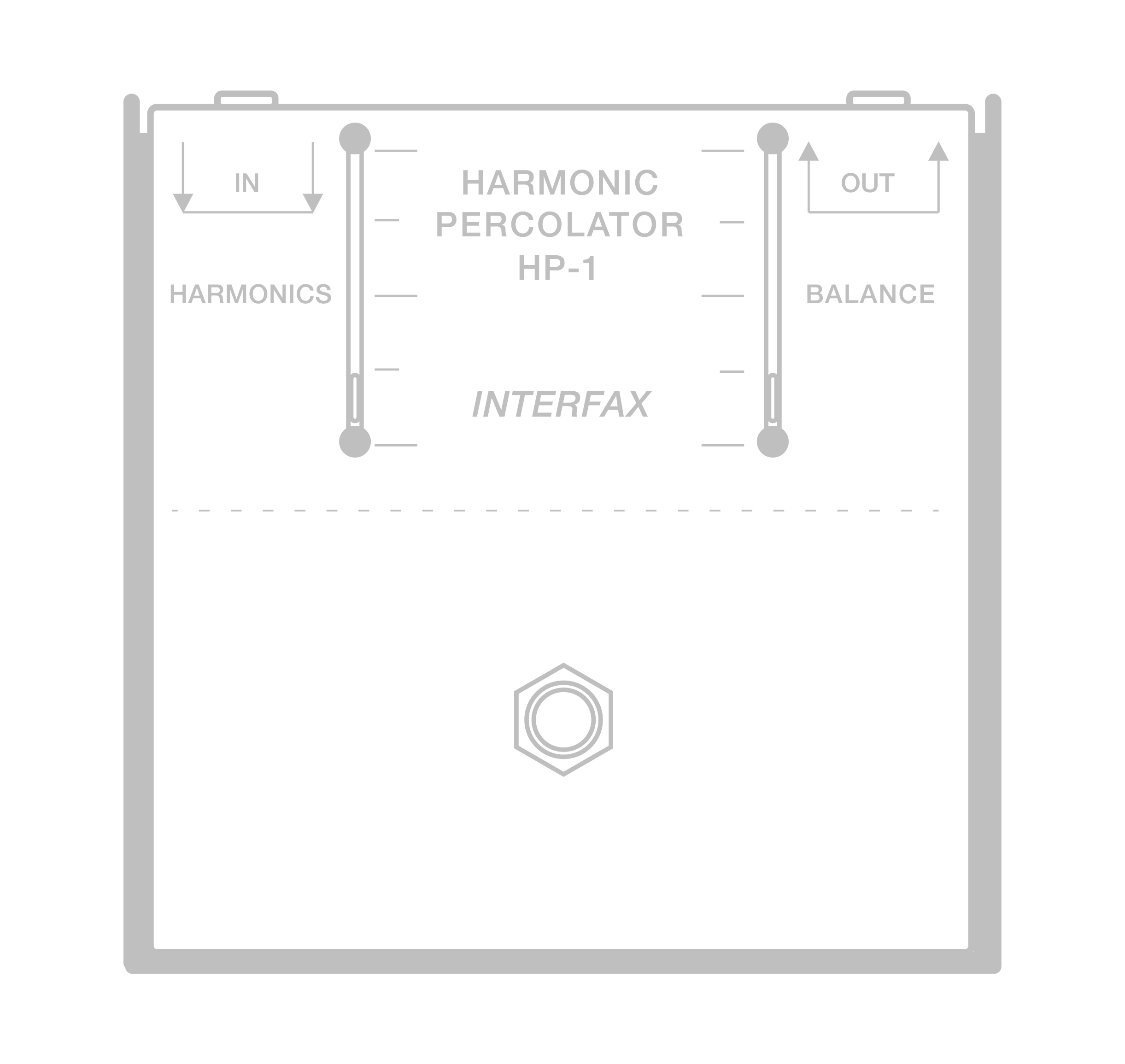
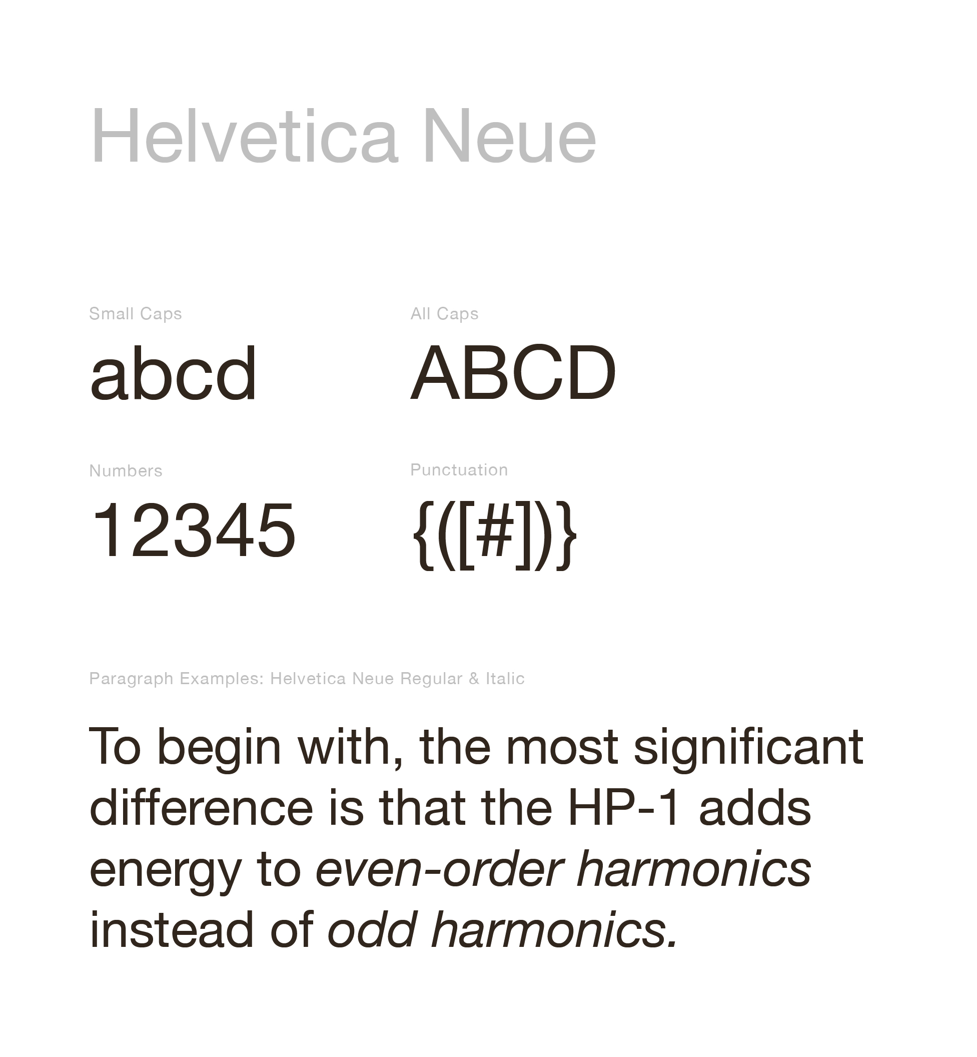
At the frontside it has overall safely balanced symmetrical layout with 2 slider and 1 switch in the middle. Minimalist approach with perfectly readable brown text and parameter to match its frame. Typographically-wise it used All caps Helvetica Neue medium with nice calculated tracking and leading as a legends to its control, its all only use 3 kinds of font sizing at a rational size, adds more point to minimalist side. Control parameter use stacking thin horizontal line (equaliser style) next to its slider. Thats all of it, as you might want your fuzz/distortion have a dark colour and terrificly complex illustration with fierce and bold typeface, but not for this one (it has no skull on it, sorry :c ).
With its appealing look of chocolate and milk colour, clean looking design, neat minimalistic layout, and nicely arranged set of typeface, HP-1 gave a delicate looking attractiveness, breaking the stereotype of how other fuzz/distortion related gears stereotypically looks.
With its appealing look of chocolate and milk colour, clean looking design, neat minimalistic layout, and nicely arranged set of typeface, HP-1 gave a delicate looking attractiveness, breaking the stereotype of how other fuzz/distortion related gears stereotypically looks.
Verdict:
Lorem ipsum dolor sit amet
Lorem ipsum dolor sit amet
Art Director
Michael Alexander
Senior Designer
Candya Pradipta
Muhammad Mirza
Michael Alexander
Senior Designer
Candya Pradipta
Muhammad Mirza
Team Notes
“YCIFI is our first South Korean client. And of course it brought enough challenge for us to understand and to adapt some of their culture and taste in design. Overall it’s a fun project with enough room for graphic experiments for the team.”
“YCIFI is our first South Korean client. And of course it brought enough challenge for us to understand and to adapt some of their culture and taste in design. Overall it’s a fun project with enough room for graphic experiments for the team.”
All images & contents © 2012-2022 SANROK Studio. All rights reserved. No part of this publication may be reproduced, distributed, or transmitted in any form or by any means, including photocopying, recording, or other electronic or mechanical methods, without the prior written permission of the publisher, except in the case of brief quotations embodied in critical reviews and certain other noncommercial uses permitted by copyright law.