SOSITI
Branding | Food & Beverage
We’re quite fond of coffee here—some of our team members can’t even function without caffeine dosage in the morning—so coffee shop project is always exciting. This time is a bit different however, because we’re faced with two of Indonesia’s best coffee judges who came together to make a proper third-wave coffee shop.
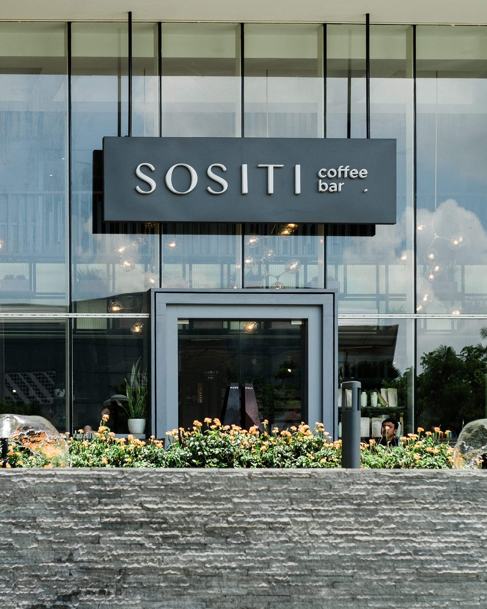
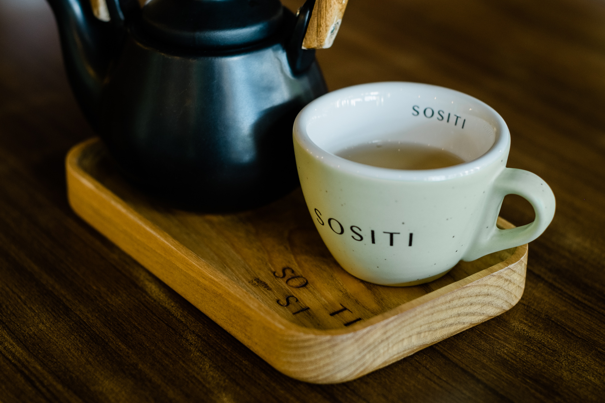
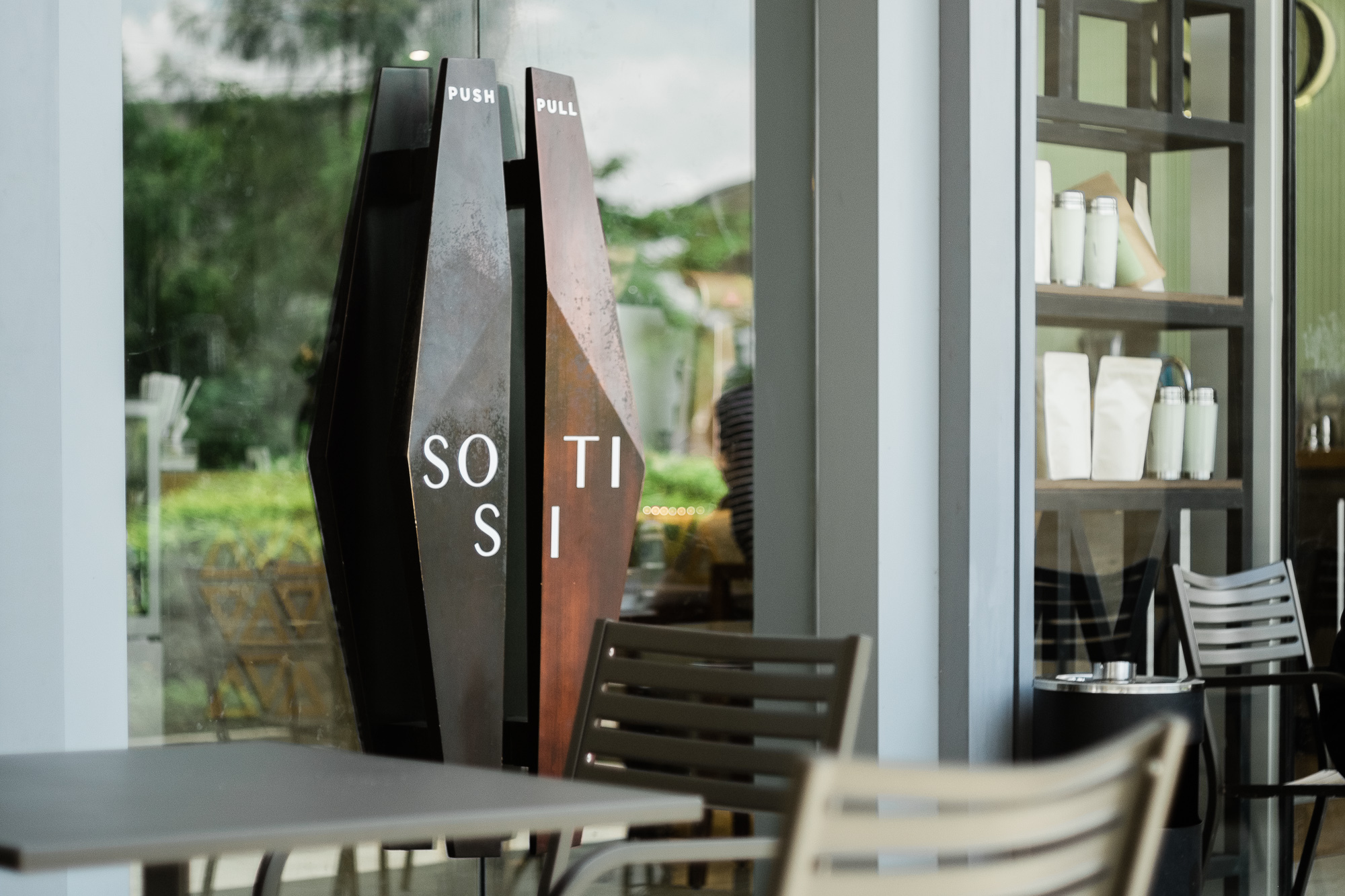
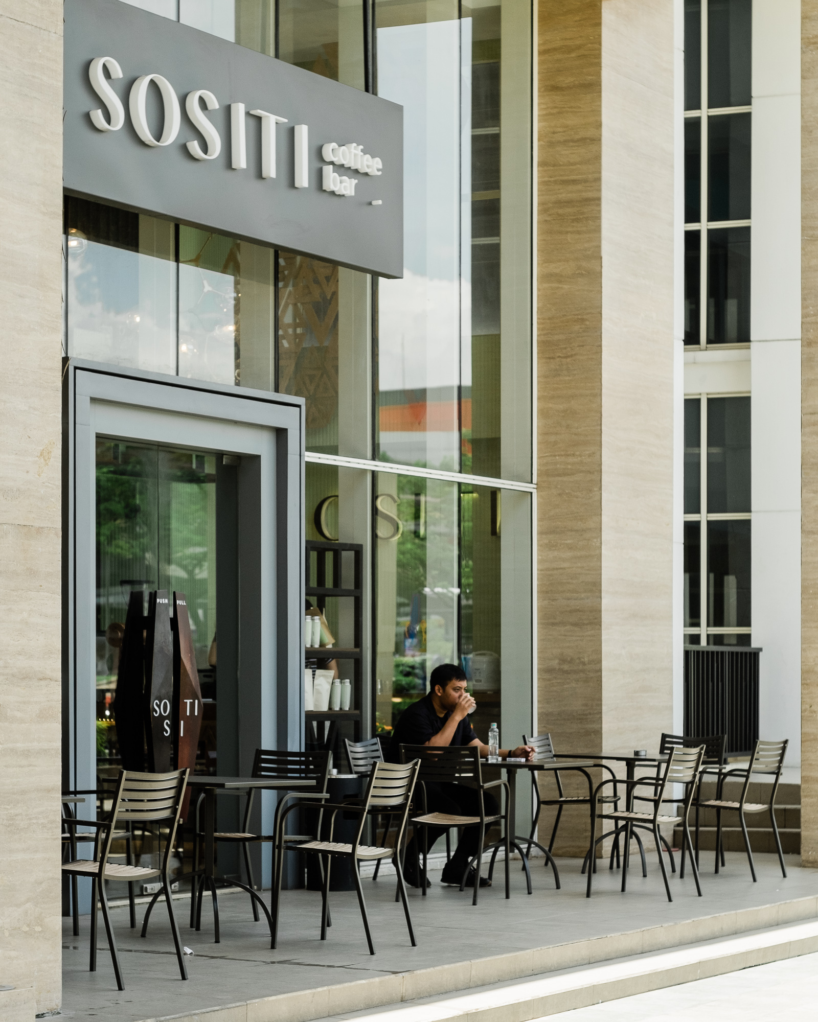
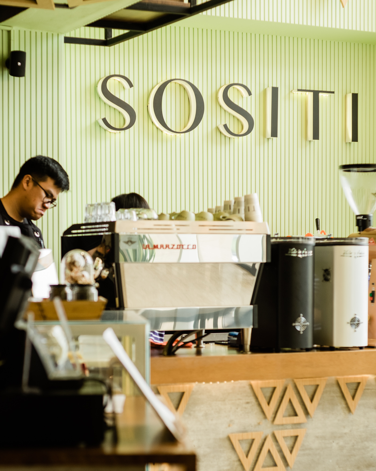
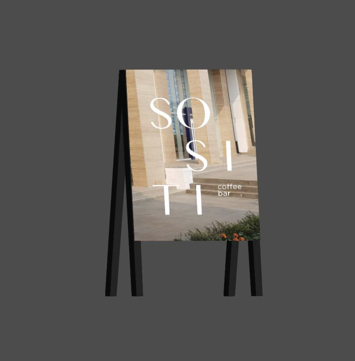
SANROK created the whole visual branding, signsystem, interior elements and packaging.
SANROK created the whole visual branding, signsystem, interior elements and packaging.
“Sositi” is an Amharic word for “three”, referring to “third-wave coffee shop” where coffee shops began to take an educated approach in serving coffee and put in extra care in sourcing the beans responsibly. When pronounced quick enough, “Sositi” sounds like “society”, which how third-wave coffee shop now has become. The word’s origin is also a homage to coffee history, which first started in Ethiopia, the horn of African region.
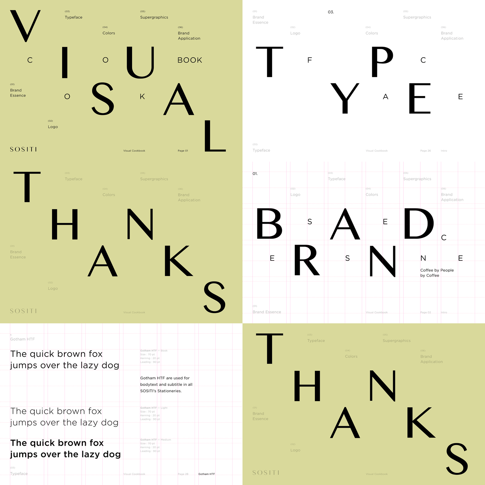
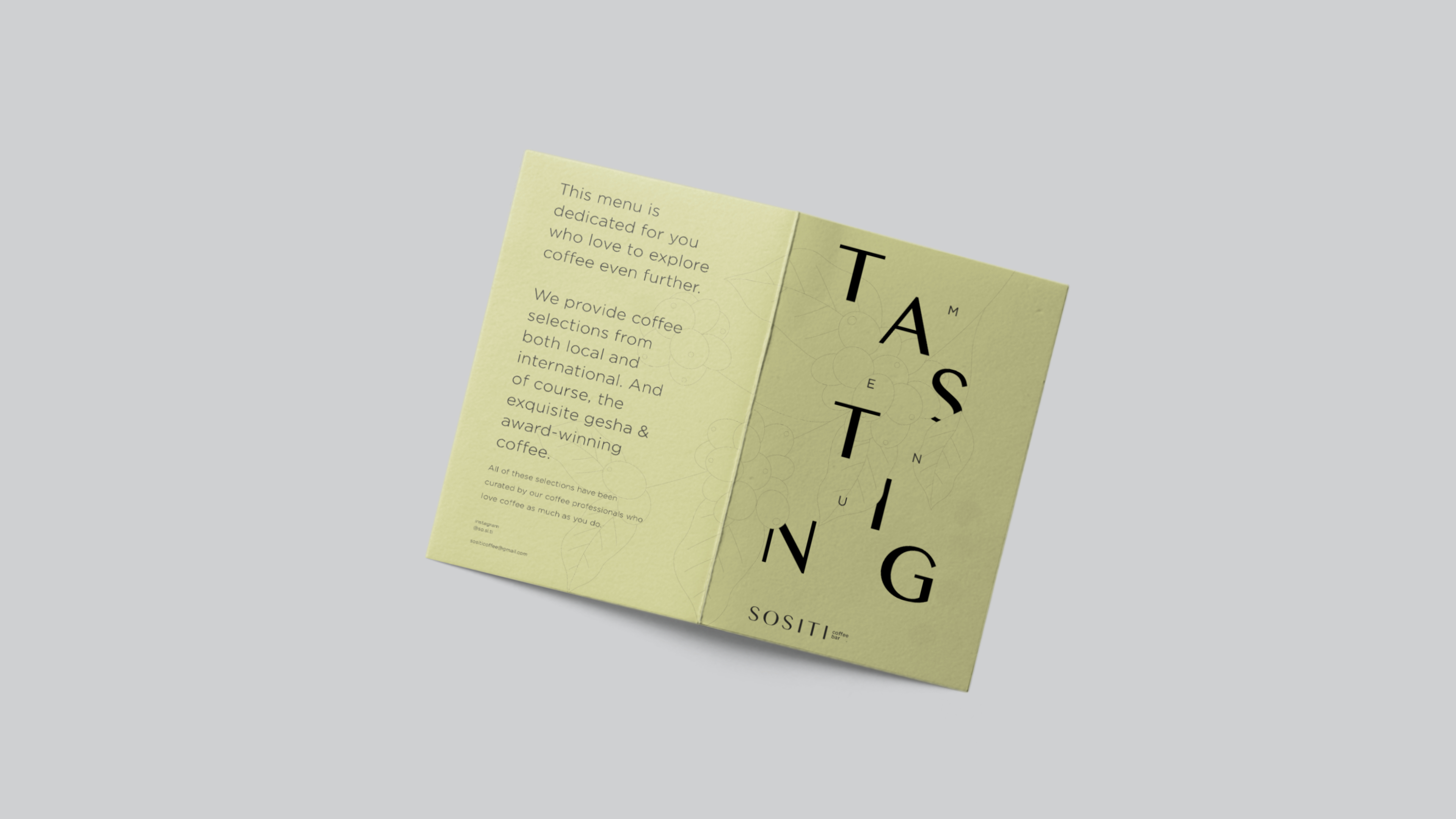
For the visual direction, we used 2 key elements: Play on typography and Muted colours.
For the visual direction, we used 2 key elements: Play on typography and Muted colours.







Art Director
Michael Alexander
Senior Designer
Muhammad Mirza
Nandiasa Rahmawati
Copywriter
Tiffany Alexandra
Michael Alexander
Senior Designer
Muhammad Mirza
Nandiasa Rahmawati
Copywriter
Tiffany Alexandra
Team Notes
“Working with legit coffee judges sure gave us some anxious moments at first, but we learned so much about coffee history and the industry from them. We had quite a bit of fun experimenting with the typography—our designers took the ‘wave’ concept and just ran with it.
Also, this is one of the F&B projects where we were given the opportunity to design from top to bottom (brand identity, packaging, menu, even the door handle) so it was very satisfying to see them came to life.”
All images & contents © 2012-2022 SANROK Studio. All rights reserved. No part of this publication may be reproduced, distributed, or transmitted in any form or by any means, including photocopying, recording, or other electronic or mechanical methods, without the prior written permission of the publisher, except in the case of brief quotations embodied in critical reviews and certain other noncommercial uses permitted by copyright law.
